Thursday 2 February 2017

Environmental Storytelling 2

Batman: The Animated Series

Batman: The Animated Series is one of the most important animated series to use the backgrounds as it's storytelling. This series uses all black cards to do it's backgrounds on, and uses pastel over the top for every scene, completely hand drawn. The importance of using black card instead of white, is it sets the entire tone for the series.

As we can see here, the darkness of the image is clear, and that is because the black comes first, and then is worked backwards in order to create the light areas, which highlights the scene and creates a reference point for where the scene is going to go. As well as this, it creates a real depth to the entire scene and really drives home a sense of scale in which to work off of.

Environmental Storytelling

INSIDE by Playdead 

Inside is a game produced by PlayDead games, during this game, the Environment tells the entire story. The game takes on a puzzle style where you have to interact with the environment to progress through the game. The entire game takes place on a side scroll, where you can see things happening in the background, whilst you are in the foreground. You constantly see people interacting with stuff and it gives you a lot of information about what is happening because it is so prominent throughout the game. 


Take this screenshot for example, you are only on one plane, and you cannot move towards the camera or away from it, you can only move left or right, but there is still things which your character is looking at constantly. As well as this, you are always mainly in the dark for the most part of the game, whilst the background remains mostly in the light. I believe this is quite interesting because most games have the opposite, where your character is always in the focus of the light and the background is less clear. I feel that this was a deliberate decision on the part of the designers as it really assist the creepy tone and feel of the game. Again, there is 0 dialogue at all in the game, so the environment is constantly telling the story. 

Life Drawing

Rhythm is a Dancer

During this portion of the life drawing we were set, it was made up of many, many 10 second long drawings, this proved very challenging and doing it in pencil was impossible. It worked much better to do in felt tip pen, as the lines could be quick and clear whilst maintaining the form of the person. 

Puppet on a String

This life drawing task was also quite challenging to accomplish in only 20 second poses, I decided to keep with the use of felt tip pen for this as it still proved quite challenging to maintain the form in a  clear way in pencil. However I enjoyed this one quite a lot as the rushing of it meant if you missed one, you missed one, no going back. 

Pushing it 

These 5 - 10 minute sketches were supposed to show a person pushing or pulling an object, which I think I displayed quite well. For this I decided to use a different medium, this time i went for fine liner. I chose this because I wanted to show the full forms and shapes of the person I was drawing, but i didn't have time to worry about shading and texture, so going for fine liner meant the areas I wanted dark, could be made dark very quickly and without messing around with all the full forms. 

Strike a pose 

This task is what I considered as proper life drawing, with 30 minute poses of drawing, for this I finally decided to use pencil, this time I could fully texture a drawing and make it look like the person it was supposed to look like, I really enjoyed doing this, as life drawing is something I have wanted to get into for a while, and my style is very different to being realistic, so it was a nice change of pace out out my comfort zone. 

Character, finishing it off

Turn a Round 

This was my final turn around, due to technical difficulties, it was turning blue when I was trying to export it as an mp4, therefore I exported it as an animated gif, and then put it into adobe premier in order to have it be the right colour, and also so I could make it the required 4 seconds with multiple spins. All in all I am very happy with how this turned out, when exporting it also gave the character this grainy sort of texture, which I was quite pleased with as it gives him the look as though he is actually wearing clothes, when before it was just block colour. I am happy with the shading of the character too, it stays mostly consistent throughout the entire thing. The one problem I do have, is that the scarf jumps a bit, but it is not a major flaw and it is only noticeable in 1 or 2 frames, so it is ok. 

This was the t pose I eventually gave my character, this was done on sketchbook pro as well, with there being a 1 quarter drawing in pencil in my sketchbook, which I will turn in to a full sheet before hand in. If I have one complaint about my character's design in general, it is his colour. I stuck with the first colour that came to mind with the scarf, and worked his colours around that, when I should have experimented more, and given him some different variations. I actually wanted to give him a blue scarf, as I quite liked the way it looked when I was having trouble exporting. 


Poses 

Before I had done my turn around, I had done many poses and expressions which gave him a little more depth of character and made him a bit more life like. I gave him some poses which would fit with his character, for example looking up in the air, and staring at himself in his reflection, his character is very curious so I wanted to show this in the poses. 


I gave this character some different variations throughout, and I think his evolution is clear, he started off being a little dumpier, and his ears were significantly larger and rounder. When I started drawing him digitally, he became very clean, rather than the messy look I was trying to do for. Although I like his final version, I wish I had kept a bit more true to the original. 

Wednesday 1 February 2017

Character... blue?

Quite a serious problem seems to have occurred when I export my turn around, in that he turns blue whenever it is exported as a .mp4 or .mov. I am really confused as to why this has happened, I have tried to look into bit rate, colour exposure and everything I can think of to fix this, therefore I will need to think of a way around it.

This is what the turn around is supposed to look like, but obviously spinning. for some reason it only wants to export as an animated gif or as a png file type. This is a major problem and I am trying to fix it as fast as possible.

Character Design - Starting the turn around

I just about knew what I wanted my character to look like fully, so I did a few a3 drawings of my character so that I could get a better grasp for how he fit together as a character. When Starting the turn around, I decided to look at turn a round's that other animators have done before. doing this I looked at Batman: The Animated Series, Young Justice and Justice League the cartoon shows. I chose all of these to look into because of them being easily accessible online such as on instagram. I decided to do a quick t pose of my character, not including the one I had already done which was required, just to see how he would form on the turn around. I started by doing an under layer turn around where it was only his very basic shape, and then build on top of it with a line turn around.

This is the turn around before it was coloured, I am quite happy with this even though the scarf is off in 1 frame, apart from that, it serves it's purpose incredibly well, and I am probably most proud of the way the facial shape changes as he turns.


Character Design 2

Giving Him a Face

I decided that the next step of creating my character was to give him a face, as well as giving him some shape and depth. I decided his outfit should look worn, as though it has been broken and self repaired at some point, as though he has been given a full outfit, but he has been out of a home for so long that he has had to make some self repair. Therefore I decided to give him some patchwork elements in his outfit, I also decided to give him some longish hair, and make it slightly messy. I wanted to make sure his homeless element, which is important to his development, was clear throughout. His body shape is slightly different from the standard body proportions of a child, but that was ok for me, because I wanted him to be exaggerated, and have exaggerated features, therefore this was not an issue. I had seen an artist on instagram, use a similar shape to my character when doing his own interpretation of "Harry Potter", which I thought was really cool and I decided to take inspiration from this.


CHARACTER DESIGN!!!


NEW BRIEF

So I am finally excited about a brief for Visual Language, it is character design. Character design is something which I love to do, and the brief requires us to base our character on the places in which we did our environments. Immediately my thoughts go to a homeless person for the dark arches. My first step was to design basic shapes and make them abstract. With just simple shapes it is easy to get a simple body shape for a character, my shapes of choice were a circle, and 2 rectangles, as I thought this would be easiest to morph into the shape of a young child.


These were some development sketches of my character, there is no face yet, or even bodily shapes, there is however the addition of a scarf shape which is obvious. I decided that because of where he lives, the dark arches, he should have something that signifies keeping warm. When I created this character, I made his backstory first, by giving him the name of "Theo" who lives in the dark arches. Theo is only 10 years old, and I decided to have him run away from a bad orphanage, so he could have the look of being homeless in the dark arches. Below are some of the development sketches of my character without the facial features and the such as of yet. I have not yet decided on the look I want to give him, but these I think are a good starting point.

French Horn, It Continues...

FLIPPING THE WORDS

Another week gone, another week of French Horns to draw, if I am completely honest, I have had more fun completing briefs before... none the less, I Have had more time to think, and more time to develop some ideas relating to the French Horn project for Visual Language. I made some fair old progress this week, and an idea of what to do for my storyboard is starting to formulate relating to my own feelings on this topic.

Progress

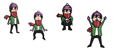
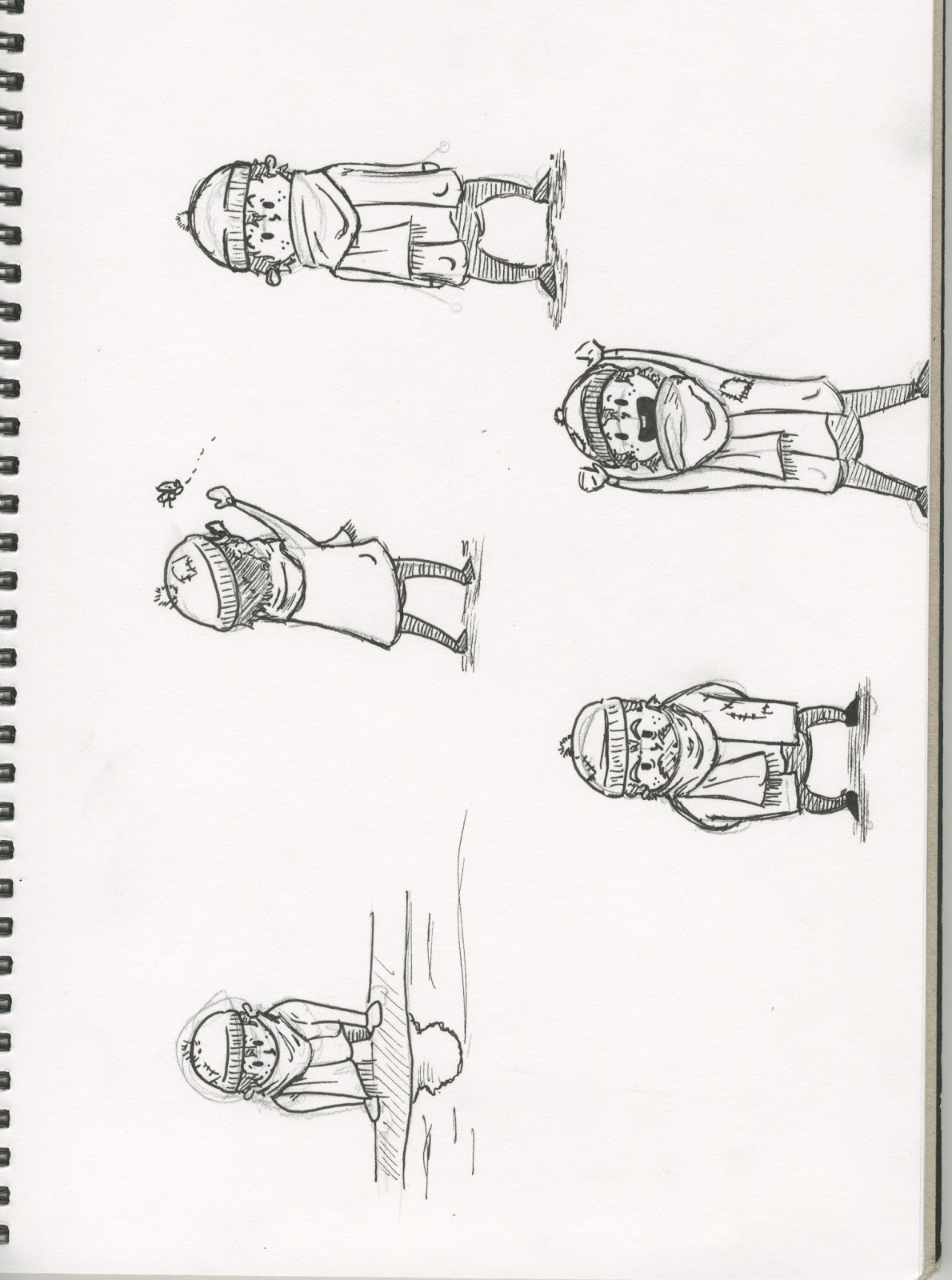
My main takeaways for this week included the thinking of "if I flip the words, it makes 'horn French'" which immediately made me think of "Horny Frenchman" naturally. From here I made 3 drawings, all of which are weird, and I did limit myself to 3 so it didn't become even weirder than it already was. These can regrettably be seen below:


Movie Soundtracks

When I thought more about movie soundtracks, my thoughts jumped to some classics as "Jurassic Park" and "Batman". So I decided to incorporate these into my 24 drawings by including some photo shopped images of some classic posters reimagined but with a French Horn added to the mix. Different Mediums were encouraged for this brief, and if I had spare money, I would have like to do some pastel and water colour drawings, however with the limited mediums I have, I will have to deal with this by substituting physical mediums for digital mediums instead, not ideal, but I have to work with the mediums at my disposal.


French Animals  

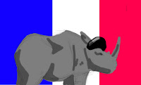
I am honestly not sure how it came to this, I just started grasping at straws desperately and thought of animals with horns and making them French, which is when I found out that the Laughing Cow is a French Product, and Frenched up the logo a tad, I'm not sure if this counts towards my 24 drawings in all honesty because I edited something and drew over the top, I am certainly hoping it does, because I am incredibly stuck for ideas.


The French Busker

For my storyboard idea, I wanted to tell the story of a sad French busker playing a horn in central Paris, I thought this was a safe idea, because this brief is sending me into a block at every single turn, and making me wish I had better ideas for this, because I do not think I have had any Ideas which I am happy with.


Rocket, Lizard, French Wha....t?!

Visual Language

We were given a new brief this week, for "Visual Language" where we are required to make 24 or so sketch like drawings all relating to 1 word. On hearing this, my initial thoughts were "easy" and "awesome", and even when people started to get their words, I continued in this thinking. People around me were given "lizard" and "Rocket" and "Flower", all great things to base a sequence of drawings from. Little did I know, when it got to me, my word was "French Horn". Honestly my thoughts on this are that I have been cheated, and I have never been so confused by a brief in my life. Instantly my motivation for this topic has been halted, and I would much prefer to work on my animation skills. However, it needs to be done, so I have been trying to think about the different ways in which I can interpret the 2 words, not in a literal sense, but treating them as separate words. My other thinking is that I can try and relate the instrument of French Horn to myself and my interests somehow.

Firstly, I made the mind map (shown above) to try and kick star my brain into thinking of something. When I think of French Horn, I think of Orchestra, which immediately makes me think of A) The Tom and Jerry episode where they fight over who conducts the orchestra, and B) Movie Music, the French Horn must have been used to make some of the deep sounds in a movie's score before. This type of thinking helped me to take a grasp on the situation a little, although not completely, and I am still unsure of where to take this project next. I started out by doing some quick sketches of what I thought about, which ended up being a Storm Trooper using a French Horn Instrument, and a French Bull with the French Flag wrapped around his horn. Unsure as of yet where I am going to take this next.

Environmental Drawings 2: Return to the Dark Arches

Return to the Dark Arches

After seeing the effect on the lighting that drawing in straight pen had on my train drawings, I returned to the dark arches with more equipment than the last time. One thing I had not considered, which worked out in my favour, was the time of day, whereas I had gone the first time in the morning, this time it had been evening/night, which greatly effected visibility down there. Needless to say, I feel as though this change in lighting enhanced my drawings.


When drawing on the train again, I this time had the advantage of a table as well which meant the drawings could be steadier, I again went for pen due to the restricting time and limited space of the train and I again loved the way it made the lighting look, if anything, I would like to try a drawing inside the train using the same black shadow style I used for the dark arches, with large black areas driving home the idea of shadow and light areas.