Wednesday, 7 December 2016
THE FINAL ANIMATION
Character Turn Around and Change of Idea
Character turn around


This is the character turn around I came up with upon returning from MAF, I decided animating the character was becoming far too hard without one, so I decided to do one now, based on the design of "Red Turtle" the studio ghibli animation we saw at MAF. I loved the way the eyes looked in this animated feature, so I took some inspiration from that style to update my characters.
CHANGING IDEAS AGAIN!!!!
I have decided that with my time constraints, I have been too ambitious in what I wanted to achieve with my animation, therefore I decided to go back to my original idea, of having the 2 on the train. This does mean scrapping my backgrounds I have already done, however the animation is going far too quickly, therefore I want to change my idea again, back to what it originally was. This is going to be quite a challenge in the next 5 days to try and get the animation redone, I will try and use the animation I have already done and rework some of it so that I am not overworking myself. Below I am posting the first scene of my new animation. It is only 2 seconds so far, so I need to get working on more. The problem with this, is that it has no animatic or storyboard, so I am taking my old storyboard to try and time it out, I am scared however that this will mean it is far too rushed and wont work the way I want it to.
ANIMATIC AND THE START OF THE ANIMATION
This is the animatic for my animation, in this we see the storyboard come to life, without the detail, and just as a simple line map. I was going to do my animatic as a storyboard scanned in, but decided against it, because the storyboard I had done, did not show the correct amount of movement, and therefore the timing of the animation would be off. However, I have not yet done turn around of my character, and it is becoming increasingly difficult to draw over and over. Therefore I am going to start doing a turn around,
This is the start of my animation, now with a bus moving in. I am quite happy with how this turned out, especially the bus, however I feel as though this animation will be too quick, and I need to sort out the timing of where everything is going to go. As we are going to Manchester Animation festival next week, I feel as though some work is going to get unfinished, so I need to make a plan on where y animation is going to go when we get back.
ANIMATION - THE START OF AN ANIMATION
Re-storyboard

Background tests
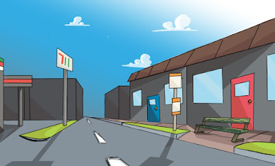

When starting my backgrounds, I had to decide on the aesthetic of what I wanted the background to be, so I decided to draw up 2 different ones. 1 decided to go with 1 very clean, and 1 which was very sketchy. I knew I would be animating in sketchbook pro, and therefore I could choose which one to implement and when. Overall I was more impressed with the top one, as I believe the lighting in general was better, and went for the general feel that I was going for. The way the backgrounds were done, is using reference from google maps, as I cannot visit the area anymore, and also using the quick sketch and sketches on my storyboards for this animation. The 2nd one on this had a sort of fish eye effect, which I really enjoyed and therefore may go back and visit at a later date.
ANIMATION: RETURN OF THE CHARACTER
CHARACTER DESIGN AND STORYBOARD?
After messing around with backgrounds and character design some more, I decided it was about time to start storyboarding my animation. I knew generally how I wanted it to play out, and the type of shot I wanted to use, however I knew pulling them off was going to be hard, so having a storyboard would definitely help with this.

This was the basic storyboard which I mapped out for my animation. With this, I tried to explore the vibrancy of the colour in the character's hair, and play around with different shots which would make my animation interesting. I really liked the way this storyboard turned out, and I would love to say that I kept to this however..
The problems occurred...
My own worst enemy, is myself, as I overthink things, and therefore have a tendency to change my idea. I like the concept of my idea, however, I wanted to change my designs and the setting of the animation from a train, to a bus, and the characters to be younger looking do they were easier to draw. I thoroughly believe in my original idea, however, I feel as though the animation might be stronger if it has a more simplistic art style.

This is the new direction I want to take my characters. I have made them look younger, I have given them faces for more emotion, whilst still maintaining the minimalist detail in their appearance. I feel as though this will make the animation far easier to animate. I will now re- storyboard my animation going into the weekend, and then produce an animatic of it so that I can start the animation itself.
ANIMATION: THE CHARACTER DESIGN STRIKES BACK
ANIMATION PROGRESS:


Backgrounds
As well as these, I also wanted to consider some backgrounds for my animation, which I did by looking at the inside of a train carriage online, finding a few reference sources, and experimenting with digital colour on these images.

ANIMATION: A NEW BRIEF
AN ANIMATION TASK
Thoughts on this new task
Although I am busy at work on visual language with the 24 drawings brief, I immediately started working on ideas for the new animation task we have been set. Which is a 10-15 second animation portraying a word of choice from a list. Immediately my eyes were drawn to love, longing and fear of the words, as all 3 I could relate to.
My idea
The idea that I had, is a guy sitting on a train, and seeing a girl, who smiles at him, and blushes, the girl then leaves the train leaving the guy reaching after her in a longing pose. The way I envisioned this, was on the London underground, where the seats face each other, therefore making the idea work. This would also mean that the area would be quite crowded and therefore I want to have a definitive feature on each of the characters, at the moment I am thinking of having the hair of the main 2 characters be a significantly different colour which would make them stand out to the crowd, this will probably end up being either pink or blue.Potential Problems
Even before starting any designs for this animation, it does feel very complex already, however I feel as this it is a solid concept, capable of showing the emotion I want, so I want to challenge myself and see if I can pull it off.
The Final Storyboard
The Final Storyboard
When it came to the final storyboard, I experimented both in digital and hand drawn for the final one. However, I decided to just keep to hand drawn, as I was much more comfortable with this.The images show my final storyboard itself. Overall I was very happy with the way my storyboard turned out, in my opinion, it portrays the story I was trying to tell, whilst also putting a twist on to the classic nursery rhyme of 'Baa Baa Black Sheep'.
What I did well:
In my opinion, which was supported by my peers in a critical analysis, what went well most of all, was the shading. The darkness of the storyboard set the tone of the story which enhanced it in a new light and made it feel much more sinister. A note from my peers also said that my range of shots was good, meaning that the cinematography displayed in the storyboard was executed well. I also enjoyed the usage of shadow I displayed with this.Things to improve:
What I feel I could improve with this storyboard, is having more frames in there to show the motion of each character's movements, I think if I put the storyboard into an animatic it may look very jumpy therefore in future, I will make sure to include all the motions of my characters in my final storyboard, just to make it more "animated" per say.My final thoughts on this storyboard are generally positive, it seemed to be well received by my peers, and the use of shadow, and the coherency of the story were shown well.


Tuesday, 6 December 2016
The Tale of the Storyboards
Storyboards
The task of the storyboard, was to think of a nursery rhyme, and present it, as a storyboard, with matching visuals for the rhyme itself. There was no limitations to how we presented this, in terms of style or tone, we were given a free reign on most things. Therefore I chose to do Baa Baa black sheep, with a twist. In my opinion it would have been too obvious to just go with the classic tale of baa baa black sheep without updating it, and giving it my own personal twist. So I decided to take a more dark and sinister approach with it, almost like a horror movie, whilst still staying true to the rhyme. To start this I searched up the rhyme, and started to make some initial sketches as to where I wanted the storyboard to go. I started with sketches of the sheep, trying to figure out how I would make a small innocent little sheep look sinister.

This is the original concept that I came up with. this had 3 images of a sheep, a long with a quick sketch of a character that would be talking to the sheep in the setting.
Along the lines, I thought about making the sheep some sort of black market dealer, with, stereotypically in movies, are usually smoking, sitting behind a desk, in a large warehouse, so I decided to give these features to the sheep, in some sort of anthropomorphist way which would make the sheep a little bit more human.

After deciding on my general story, the next step was to decide on how the story would look visually. The best way to do this, was to draw it out roughly using post it notes and then put it up on the wall so that I could see where each drawing would go in terms of the animation. Having now drawn out all of the post it notes, I can start drawing up my storyboard in full. I plan to do this digitally, however I will decide which looks better at the time with a few simple tests. I also know that I want to make use of shadow to make the scene more sinister and dark than the original nursery rhyme.
Monday, 5 December 2016
Side Post - The idea change behind the 24 frame Animation
My Original Idea
The original Idea I had for "strike a pose", (the 24 frame animation which shows an object moving from one place, to another) was to make an egg fall over and hatch out a little chick, or at least have the implication of this.

This is the original behind frame map for the 24 frame animation where I was deciding where the key frames should go. However, I quickly decided against this idea, as I wasn't too sure of where everything should go and I wasn't passionate about the idea at all, it was only an idea because I had to make it an idea, which personally I hate doing, so I decided to move on to something a little closer to my interests.
 This was the idea for my 2nd attempt at the 24 frame animation, It showed a character, Batman, jumping from one rooftop to the other. I was more passionate idea, as character design is something I love, and making characters move is something I am eager to learn. My concern for this, was the timing, and the complexity of the character moving and jumping as my first lone animation. Therefore I decided to zoom into the animation and make it a walk cycle instead.

The idea then changed to a walk cycle of Link from the Legend of Zelda series. I really enjoyed this idea, and I was happy with the drawing overall, however this was too complex as well as it would involve a lot of components moving, and for my first proper animation I decided to again change the idea, however I would like to return to this idea in the future and try it again. It was becoming ever closer to the brief deadline however so I decided to go for something super simple. Which evolved into the final animation which is shown and explained on the previous post.
Subscribe to:
Comments (Atom)