Thursday, 9 May 2019

Extended Practice - Animation?

From the beginning of extended practice, I told myself that I was going to animate my final film as well as produce an awesome animatic would showed off some dynamic angles and framing, whilst telling a cool story. Which I held on to far too much. Before I had finished my storyboarding, I started animating on the first shot, getting way too ahead of myself. Here is this animation:

What changed? 

As I was working on this animation, and looking at the schedule I had laid out for myself before the hand in, I decided to take a step back and ask whether I wanted to rush this film I wanted to make my most dynamic animation yet. The answer I came to was no, I had not yet finished cleaning up my animatic and my last live brief was still to be done at this time, so I decided not to animate my final film. Yet. As of now my plan is to give myself time after this hand in to animate on it with some help from others, to have it in our final year show, as I want to give it the necessary time to make it as good as it can be.

My main specialism this year has been storyboarding, and that has not changed, so I wanted to give the storyboards their due respect and have them be as good as I can currently make them, rather than rush to finish my storyboards and then rush to animate a final film that I wouldn't be happy to submit.

I believe my animation will look awesome in the final year show alongside the others, and that will come from giving it the time and work it deserves.

Extended Practice - Animatic Final Clean-Up

After responding to the feedback that was given to me, I made a final pass on the clean up of the animatic. I also was able to put in all of the final backgrounds so that all the cuts make sense in relation to where the characters are in the frame. Here is my final animatic:


I am pretty happy with how this animatic turned out, there are some definite timing issues, however overall I think the work is solid. The backgrounds fit really well with the style of the animation.

What worked:

I think the framing and the movement is clear, I think it translates well for animation, and it has a clear narrative whilst following the basic cinematography rules. I think the drawing is clear, and the characters are separate to the point where it is clear who is doing what. The layouts I had in the original version of the animatic also helped the perspective of the backgrounds which come across really nicely with my style of drawing.

What could have been better:

I think some of the movement in this animatic overall is a little awkward, when I came to clean it up I seem to have changed some poses ever so slightly and that has broken some of the flow in some areas (in my opinion). I think sound will really help bring this to life, but that is something I will work in as I get further along with animating this project.

Extended Practice - Live Brief - Yeti Storyboarding

For my final live brief, I wanted to take on something more closely related to my specialism in storyboarding. Through the recommendation of a storyboard artist from Blue Sky Studios, I found the YETI storyboarding classes online, which offer new briefs every Monday for those wanting to learn the practice.

http://yetischool.com/index.php/storyboard-lessons

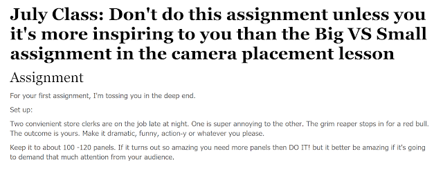
The brief I decided to take on, was more about comedy and staging, which had a concept I found funny and interesting, as most of my storyboards tend to be more action based or serious in nature, I thought it'd be fun to take on something a bit more light hearted.

This is the brief I decided to take on, and here are the thumbnails which I produced for my idea.


Overall I was quite happy with my thumbnails, and decided to take them into storyboard pro just for practices sake as it is such an industry standard. Here is the animatic I produced: 


Overall I think there are definitely improvements I could have made to this in storyboard pro, the character's often feel a bit too static for me, and some of the movement is awkward and unfunny, and does not translate as well as it should. In terms of positives I think it reads clearly overall, and the framing is nice (enough) so that the story comes across to the audience. 

I think this animatic would have benefited from sound, as it is such a comedic story, the silence breaks the immersion, which is a shame, but it is sadly something that slipped my mind until it was too late, over summer I am going to take this further and practising storyboards from sound clips, in order to better understand the relation of visuals and audio.  


Sunday, 5 May 2019

Extended Practice - Individual Background Specs

Although I had made a base background spec sheet, I still needed to make a spec sheet for each individual backgrounds, of which their ended up being 12 I needed. I made an individual spec sheet, and a map showing the camera for the scene which the background went with. This was the spec I sent to the background artist:


I included the layout used in the animatic, as well as showing the highest point which the character reaches, I did this so that the background artist would know to make the background larger than the standard 16:9 aspect ratio. There was also specifications like making the back 2 rocks on editable layers for fx animation to go on top of them and any parallax that may need to occur. 


This was the final background that was produced by the background artist for this project, based on my layout and specs. I will not show all 12 of the background on this blog for sake of time, but for consistencies sake I made a birds eye map of the area which the animation takes place in, so that it would be obvious where the camera is.

This is the map that was used for background 5, and there was a map for each specific background.

Sunday, 21 April 2019

Extended Practice - Live Brief - Godzilla Talenthouse Artwork

For another of my live brief's, I decided to take part in the Talenthouse Godzilla : King of the Monsters artwork submission. I would usually choose an animation or storyboard brief to do, however as Godzilla is such an important topic for me, having inspired a lot of my creative endeavours.


This was the material I had to use for inspiration, so I chose to go with Godzilla facing off against King Ghidorah, which I had done storyboards of previously, and I felt comfortable that I could pull it off. This is the progression of my piece, from thumbnail to final piece. 


Overall I am really happy with how this turned out, and I used the titles provided by the competition, and submitted both versions, as you are allowed up to 8 submissions. I decided, in response to feedback to get rid of the fire behind on the buildings as it would be too distracting. I wanted some strong blue lighting as that seems to be the theme of all of the marketing for the movie. I do not usually go for a finished piece, and I feel like it works well, I am especially happy with the atmosphere of the piece, I will try and improve on my general drawing skills from here on, as I think it would look a bit more 3 dimensional. 

Friday, 12 April 2019

Extended Practice - Responding to Feedback

After receiving feedback from professionals, I have reworked my animatic to make the necessary changes to my story and to cuts to make sure that it is readable and cohesive. I tried to take on all the feedback I received, and I feel that I responded to it relatively well. Here are the scenes I improved:

This is the first revision:


With this first revision, the concern was that the cut from the hero character landing to the next shot was a bit jumpy, so I added in an extra insert of him landing and ready to fight, which showed more of his character and helps the cut to the next shot feel a bit more natural.

Revision 2:


This revision adds more character to the monster on his approach, I gave the monster more intent behind his approach, adding in a small victorious roar and a close  up insert before he jumps towards the hero, showing that the monster believes it has won at this point. I also wanted to show that the monster is angry with the character, thus the angry close up insert, possibly territorial? I think this helps the shot a lot with it's intent and showing the character's emotions.

Revision 3:


A couple of minor revisions, the most prominent being the character's head, he now looks towards the gun so that the next cut makes a bit more sense, so that his eye leads the transition. The next couple of things was the flipping of the monster looking down on the hero, it now reads better with the monster's screen direction being consistent between shots.

Revision 4:


This is definitely the most significant of changes to the story, with the entire ending being different. Originally I had staged the shot as though the monster was lunging down and the shot was revealed through the monster's head, however now I have the shot directly leading into itself with the gun coming into the scene and visibly shooting the monster on his lunge down, showing the damage, and setting up for the next scene where he falls, and the hole falls on to the hero character, inspired by many different classic scenes where the hero then emerges from the hole, and stumbles out to fall next to the monster.

I also changed the close up scene to reflect this, as he is now giving a sigh of relief, up against the head of the dead monster. He then hears an audible roar, which causes his relief to turn to surprise, at which he climbs up the monster, and the camera tracks him up to reveal the other 3 monsters, at which point he leaps into action again.

Here is how the full thing reads now:


I am much happier with the flow of the story now, I think the professional feedback has helped greatly with the action and flow of the short. It is now slightly longer but the shots that are there, are all necessary for the intent of the characters.
Thursday, 11 April 2019

Extended Practice - Professional Feedback

After finishing my rough pass of my animatic, I sent it off to 2 highly regarded storyboard artists in order to gain some professional feedback. This is the feedback given by Jez Hall:


This was all incredibly useful feedback which I will respond to accordingly. It felt very professional and I got the feeling that he took me seriously as a board artist so I was appreciative of that.

Here is the feedback given by David Bunting:


I liked the critical nature both these professionals treated my board with, I did not want a series of compliments as I would not have felt like there could be any improvements, however this feedback has given me a lot of good insight into what I need to improve, and how I can make it a lot better.

Over the next couple of days I will pick up the pace a lot more and I will make the suggested improvements, some of which were solidifying some of the thoughts which I had already had, but some of which I just hadn't considered.

Extended Practice - Clean-up Tests

As I was waiting for feedback, I decided to start cleaning up the shots which I was the most happy with, as I was pretty confident in them, and I also had backgrounds for them already.

I used shot 1 as my starting point for this, of which I started by adding in and lining up the background where it needed to go.  This is that test: 


The background works incredibly well and really elevates the scene, the background artist stuck to my layout beautifully and it really helps bring the characters to life. I was so happy with this when the background was in that I decided to clean up the rest of the shot just to have it done. Here is that version: 


I am incredibly happy with how this shot turned out, I think it really adds a lot to the shot having his hair in, and also giving him the expression as it gives a sense of character. The same goes for the monster, adding in some facial detail makes him a lot more aggressive and the subtle mouth openings make him feel more alive. Ultimately I am happy with this shot, and I do not have to do anything more with it now, so I will move on to finishing off the other shots when I have gotten some feedback on how they could be improved. 

Extended Practice - Storyboard Progression 3

After the crit session last week, I had pointed out to myself that there needed to be some amendments to my animatic, such as flipping shots to make the flow of the story more coherent. I have also now finished what I am calling the "rough pass" of my animatic, which I will send off for feedback from some of my connections from PP. I will also try and get feedback from my class so that I can make sure it reads well before I start making a clean pass. I will start a clean pass of the first shot as I am confident in it, and I do not want to change it as I personally think it works well enough on it's own.

This is my rough pass:


I am quite happy with how some of this has worked out, I have forgotten to flip the close up shots of the monster here so it is making those cuts look pretty jumpy, which I will amend this coming week. I have the bliss of being able to take my time on this animatic, as if it were a longer film, I would have had to have a final rough pass by this stage. I also want to work on fixing up the ending shot, as I think it could be amended to give a little more emphasis on the monsters death, as there is a long build up with little pay off, so I think I could push that a little more.

I am also wondering whether the cut at around the 06:05 mark to the landing shot needs an insert shot first, as it may be causing a little bit of a jump in the cut. The ending shot also may be a little too similar to the opening shot in terms of how he moves, so I feel that that could be amended to read a little better for the audience.

Extended Practice - Storyboard Progression 2

Following on from Hostelworld, I knew it was time to get back into my own project, so I started again with my animatic. There is not too much to say about what is happening, there has just been some progress on shots, with some revisions in places where stuff doesn't quite make sense, I have a couple more shots to rough out before I start cleaning up, and I will try and get some feedback before I clean-up so I won't have to scrap anything that is particularly time consuming.


During my crit session, I noticed that at 09:12, the animatic sort of breaks the 180 rule, almost, and doesn't is making the cut quite jumpy, I will amend this going forward. This will also mean I have to revise the close up shots of the monster, and easy fix as I will just have to flip the shots. Flipping this shot also means I can establish to the audience that he is still holding the gun after being hit, this will make it read more clearly ultimately and will help with the pacing.

Wednesday, 27 March 2019

Extended Practice - Hostel World Animation 2

I have now finished all of my Hostelworld animation. It has taken a lot longer than I had anticipated, as there was a lot of work passed off to me right at the last minute, so it came off as quite rushed. Overall the compositing done by Liam was the saving grace on this project, as well as the 3D backgrounds, which came out looking great.

Overall we ended up with 4 different idents, with the character animation clean up all done by me, and 2 shots completely animated by me also. I am putting this one down to - I am not a clean up artist, but I will not be using any of the animation here in my showreel or portfolio in the future.


It has been fully submitted, a long with a proposal which I had to make based off team notes, which accumulated everything we wanted to say in our response to the brief.


With this, I had to accumulate all of the images into a condensed press pack of our work, including the character designs and pictures of the environments, as well as how we planned to distribute the advert, should it win. 

Overall it achieved what it needed to achieve, and I am pretty happy with the turn out, but it could have been better had I spent more time cleaning the animation up a bit more. However as animation is not my main takeaway from this module, it has served it's purpose and I will take what I have learned from this going forward. 

Friday, 22 March 2019

Extended Practice - Hostel World Animation

The past couple of days I have spent finally animating on Hostel World. I did not have much animation to do, it was just a case of finding the time between my main project. I have managed to finish and colour this one shot in 1 day, so I am hopeful that I can do the same with my next shot.


These were my roughs for my first shot. This was actually the second attempt I made at them, as TV Paint had crashed my original file, which was a bit of a set back but it was partly my fault for not backing up my work. I am happy with how the roughs turned out, I feel as though the movement translates well. As we are colouring the characters in a way which I am not accustomed to, I am hoping the movement is still see-able when it is coloured.


After finishing my roughs, I went on to the colouring phase, which we were doing with the colour fill tool, which colours as you draw the line. This meant we could get the line-less style which we were going for.  Overall I am quite happy with how this shot came together. However, as I went with the animatic sizing when animating, I am concerned that it may be too pixelated or low quality when it comes to compositing.

Wednesday, 20 March 2019

Extended Practice - Storyboard Progression

This past week I have spent on a finished, more polished version of my own project, with a lot more thought in the shot pacing and the dynamic angles which it relies on heavily to keep it entertaining. I have finished the first 2 shots for it, and now that I am fully in the swing of it, my workload should increase exponentially per week, as I know more or less how I am pacing everything.


I am very happy with how this board is taking shape. It is a readable board with a lot of consideration for the action and also with consideration for the next stages of production. I have added details where there needs to be of tradigital VFX, with the smoke from the explosion, the dust from the monster's feet and the main character's gun. I have also added clearly the camera movements, which are going to be essential to the background artist for the sizing of their document, so that it stays high quality and does not become pixelated when zoomed in for example.

Overall I am happy with how the storyboard is turning out, however my productivity has been much slower on this as I am taking a lot of time making it polished, when I should be taking the time to make it readable first, and then going back and cleaning it up afterwards. This is something I will focus on going forward, making sure I maintain a professional workload per week, and making sure I meet my own deadlines and stay on schedule.

Sunday, 10 March 2019

Extended Practice - Hostel World Storyboards

After deciding on the basic layout of our story, and knowing how we wanted to handle the advertisement using the brief and our own research, I started with the storyboard. We had made some basic sketches on what we wanted to do, so I based my storyboards on this.


This was the base sketch that I had made before any sort of designing or research happened, with an idea of how to round off the advert. Overall we decided to limit the character's to 3, as it was the general advertising rule of thirds, which we decided would work better. Also, with the time limit, it would be better to limit the amount of animation we had to do. From here I put together the backgrounds that we had of our chosen hostels, and split them like this to form a final sort of frame for me to work off with the storyboards.


This was the final frame I put together using the background designer's 3D environments. There is some framing issues but I figured that this was suitable for the storyboard at least, and could easily be fixed.


This was the animatic I put together. As with all of my more current storyboards, I considered the "action safe" area, as well as taking into account the clarity of drawing and the framing. I used the 3D assets to correctly get the framing as close as it could possibly be to the final animation. It stands at 30 seconds so that it fits with TV advertising timings, as this was designed as a TV advert. I was ultimately happy with how the animatic turned out, I think it utilises the 3D assets well. The next stage from here will be to split up the shots and to find a source of music. 

Saturday, 9 March 2019

Extended Practice - Hostelworld Research

For another one of my live briefs, I had entered into a group with 3 others to take on the YCN brief "Hostel World" where the idea was to make an ad campaign that appealed to the student market to go on holiday and stay in hostels. Myself and one other carried out some research and created a small story layout for the ad to follow. I made some contributions to these documents they were not all carried out by me. The story layout I made as a sort of brief pack that I had been sending to others I had worked with in order for us to get more or less on the same page in terms of what we wanted.


This was a research document made with some mood boards made by another member of the group in order to choose the locations we were going to use as a basis for our story.


This was the brief pack made so that we all knew what we were to expect from this advert. It doubled as a sort of story layout so that we knew what the order of things would be.

Extended Practice - Board Test and Story Overview

During the thumb-nailing stage, I was unclear on how the movement of the main character would work. Therefore I took to storyboard pro purely to test the movement of the character and camera. 


This page shows the shot in question, that I was struggling with. As is shown he uses the monsters head to project himself up and flips around to then aim his gun at it. I was unsure how this movement would work in an animated setting so I had to make a test for this. 


I have very quickly added camera movement in to this test as well, and it looks a little all over the place because I have not lined it up properly or added any sort of ease or timing to it, however I think the test was successful as it made it clear to me how to handle the movement of the scene. I think the movement looks quite dynamic, bearing in mind that this is using Storyboard Pro's own movie player and has not been timed properly, which I will do in Premier when the time comes to make the full animatic. As is stands at the time I have made this test I am in still in the thumb-nailing stage. 

From here I wanted to test whether my story worked with what I wanted to achieve this time, through thumbnails as opposed to taking it to storyboard pro without the proper considerations happening first. 


For this pass I decided to make a condensed thumbnail page from which I could see the whole story in front of me without having to flip through different pages of thumbnails. From here I will take it into Storyboard Pro as I believe it is at a place where I am happy with the shot choices and dynamic action happening. I will undoubtedly make small revisions here and there when I come to the final pass as there will be some things that do not work with in proper perspective. However for now I am happy with how the story looks. It is also a lot less shots than the original version, which will mean less backgrounds. It also means I can cut some character's who were probably unnecessary in the first place. 

Extended Practice - Post Work Experience Re-evaluation

After completing my 3 day work experience at Brown Bag Films, I had received a lot of advice from industry professionals that had caused me to take a step back from my personal project and look at my practice from a new perspective. I felt that my storyboard did not reflect my skills as a storyboard artist, and the story was overlong and did not showcase what exactly I wanted to show in this film. My goal was to create a storyboard where the action was clear and dynamic, and the story was clear through the movement of the camera and character action. However I had included a sequence which had unnecessary exposition which ultimately took away from the storyboard I wanted to make. 

Following on from this I decided it would be best to make a storyboard driven animation, which relied heavily on the storyboard, as opposed to the script. I would use the same script however I would heavily alter the shot choices and angles to create a more readable storyboard. Originally I had planned to have my storyboard finished by this point, however as storyboarding is my focus, I decided to push my schedule back a week in order to take more time editing and making a storyboard I am happy with. During this time I have let my background and character designers about the set back, and will continue to develop my story into a more cohesive storyboard that is reflective of what I can do. 

My first step here was to re- thumbnail the whole board to create a completely new shot list. I have completely scrapped the first section as it does nothing to carry the story or add to the fight scene, and is unnecessary in being there. This has brought my schedule down a lot as it is a lot less to animate. My new time code is hopefully going to be about 45 - 55 seconds. This is to account for just the fight scene section and nothing else. 


These are the updated thumbnails which I created for my project, the process was more or less the same with notes, crosses and suggestions made next to each panel so that I knew I was making the best shot I could possibly make.